
While creating your brand’s visual identity, colors and typography work together to create emotional connections, establish credibility, and influence purchasing decisions.
Picture your routine trip to the grocery store. We all react to poorly done branding, whether consciously or not. When perusing the cereal aisle, name brands always seem better. They are more eye-catching and more appealing, yet, nearly the same exact product is usually in the generic brands at a cheaper cost. Plenty of people still buy the name brand, displaying the power of good branding.
What can you do to make your brand as enticing as this blogger’s vice – Cinnamon Toast Crunch? With design trends coming and going so quickly in 2025, how do you know what’s worth embracing?
The McGuinness Media & Marketing team has been working on a new website, trying out different colors and fonts. We explored the latest color and typography options and trends that are shaping relevant brands. Look no further for informed decisions on your visual strategy.
The power of color in brand identity
Color psychology plays a crucial role in how customers perceive your brand. Studies show that people make subconscious judgments about products within 90 seconds of initial viewing, and up to 90% of that assessment is based on color alone.
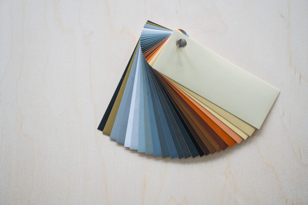
Current color trends worth embracing
- Digital-First Gradients: Modern gradients have evolved beyond the rainbow effects of the early 2000s. Today’s gradient trends focus on subtle color transitions that work seamlessly across digital platforms. Think Instagram’s refined gradient logo or Spotify’s dynamic color shifts. These gradients work particularly well for tech companies, creative agencies, and brands targeting younger demographics. They create visual depth without overwhelming the message.
- Earthy Neutrals: Warm beiges, terracotta, and sage greens are gaining popularity as brands seek to convey authenticity and sustainability. These colors tap into consumers’ desire for natural, honest products. Companies like Glossier and Reformation have successfully built their identities around these muted, earthy tones. The colors feel approachable and trustworthy—qualities that resonate across industries.
- Bold Monochromes: Single-color palettes are making a statement. Brands are choosing one dominant color and exploring its various shades and tints to create cohesive, memorable identities. This approach simplifies decision-making and creates stronger brand recognition. When executed well, monochromatic branding can appear both sophisticated and confident.
Color trends to avoid
- Millennial Pink Overload: While millennial pink had its moment in the late 2010s, the market has become oversaturated with this particular shade. What once felt fresh and modern now risks appearing outdated or generic. If you’re considering pink for your brand, explore deeper roses, coral tones, or unexpected pink combinations instead of the standard millennial pink.
- Neon Overuse: Bright, electric colors can grab attention, but they’re often difficult to implement consistently across all brand touchpoints. Neon colors tend to “vibrate” with other colors, especially digitally, which can cause eye strain, and may not show well in print. can cause eye strain in digital environments and may not reproduce well in print. Neon can be used well, however; consider a brand like Primal Queen, which tends to use bright colors that compliment the “wildness” of their brand. If it does not highlight (pun-intended) your brand’s message, you may want to use neon sparingly, perhaps as an accent color or for special campaigns rather than as your primary brand color.

Typography trends that enhance brand communication
Typography affects readability, brand personality, and user experience. The right typeface can make your brand feel modern and accessible, while poor typography choices can create barriers between you and your audience.
Typography trends to embrace
- Custom Brand Font: More brands are investing in custom typefaces that reflect their unique personality. Companies like Airbnb, Netflix, and Spotify have developed proprietary fonts that enhance brand recognition and ensure consistency across all platforms. While custom fonts require initial investment, they provide complete control over your brand’s typographic voice and eliminate licensing concerns.
- Modern Serif Revival: Serif fonts are experiencing a renaissance, but with a contemporary twist. Modern serifs combine traditional elegance with clean, minimalist design principles. These fonts work particularly well for brands wanting to convey both tradition and innovation. They’re especially effective for luxury brands, editorial content, and professional services.
- Variable Fonts: Variable fonts allow designers to adjust weight, width, and other characteristics within a single font file. This technology enables more responsive design and smoother brand experiences across different devices and contexts. Brands using variable fonts can maintain consistent typography while optimizing for different screen sizes and reading environments.
Typography trends to avoid
- Overly Decorative Script Fonts: While script fonts can add personality, overly ornate options often sacrifice readability. Complex scripts can be difficult to read on small screens and may not reproduce well across all applications. If you want to use script fonts, choose simpler versions that maintain legibility at various sizes and applications.
- Ultra-Thin Fonts: Extremely thin fonts may look elegant on large displays, but they become illegible on smaller screens or in poor lighting conditions. They can also pose accessibility challenges for users with visual impairments. Consider fonts with moderate weights that maintain readability across all contexts where your brand appears.
- Trending Fonts Without Longevity: Some fonts become popular quickly but lack staying power. Choosing fonts based solely on current trends can make your brand feel dated within a few years. Focus on fonts that align with your brand’s personality and values rather than following temporary design fads.
Strategic color and typography combinations
The most effective brand identities emerge when color and typography work together harmoniously. Here are some ideas from the McGuinness Media & Marketing team:
Maintaining consistency across platforms
Your color and typography choices must work across digital screens, print materials, and physical products. Test your combinations in various contexts before finalizing your brand guidelines. Consider how your colors appear under different lighting conditions and how your fonts render on various devices. This testing prevents costly redesigns later.
Balancing trendy and timeless elements
Incorporate current trends through accent colors or secondary fonts while keeping your primary brand elements more timeless. This approach allows you to stay current without requiring complete rebrands every few years. Use trending elements in marketing campaigns or seasonal materials while maintaining consistent core brand elements across all touchpoints.
Industry-specific considerations
Different industries have unique color and typography requirements that should influence your design decisions.
Technology and software
Tech brands often benefit from clean, modern typography paired with blues, greens, or sophisticated gradients. These choices convey innovation and trustworthiness. Avoid overly decorative elements that might distract from your product’s functionality or create usability concerns.
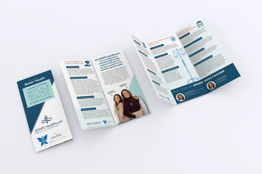
Healthcare and wellness
Healthcare brands typically use calming colors like blues and greens combined with highly legible fonts. These choices build trust and ensure important information remains accessible. Avoid colors that might create anxiety or fonts that could compromise the readability of critical health information.

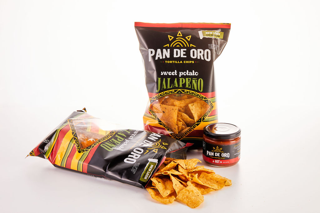
Food and beverage
Food and beverage brands have a lot of flexibility. These brands range from fun and funky to sophisticated and timeless. They can embrace warmer, more appetizing colors paired with fonts that reflect their personality — whether casual or upscale. Consider how your colors appear in food photography and how your fonts work on packaging materials.
Financial services
Financial brands often use conservative colors like navy, gray, or green with professional, readable fonts. These choices convey stability and trustworthiness. Avoid trends that might undermine credibility or create concerns about professionalism.
Competitive analysis
Research how your color and typography choices compare to competitors. You want to stand out while remaining appropriate for your industry. Identify opportunities to differentiate your brand through unique but effective design choices.
Testing and implementation
Before committing to new color and typography choices, conduct thorough testing across your target audience and various applications.
Audience testing
Show your color and typography combinations to representative users. Gather feedback about their emotional responses and practical concerns. Pay attention to comments about readability, professionalism, and brand personality alignment.
Technical testing
Ensure your colors and fonts work properly across all digital platforms and devices. Test loading times, rendering quality, and accessibility compliance. Consider how your choices affect website performance and user experience.
Building your brand’s visual future
Successful brands balance current trends with timeless design principles. Your color and typography choices should reflect your brand’s personality while remaining functional and accessible.
Start by defining your brand’s core values and personality traits. Then evaluate current trends through this lens; embrace elements that enhance your brand story while avoiding changes that might confuse or alienate your audience.
Brand evolution is a gradual process. Make thoughtful updates that strengthen your visual identity without requiring complete overhauls. Focus on creating lasting connections with your audience through consistent, well-executed design choices.
Your brand’s visual identity is an investment in long-term success. Choose colors and typography that will serve your brand well both today and in the years ahead.